About
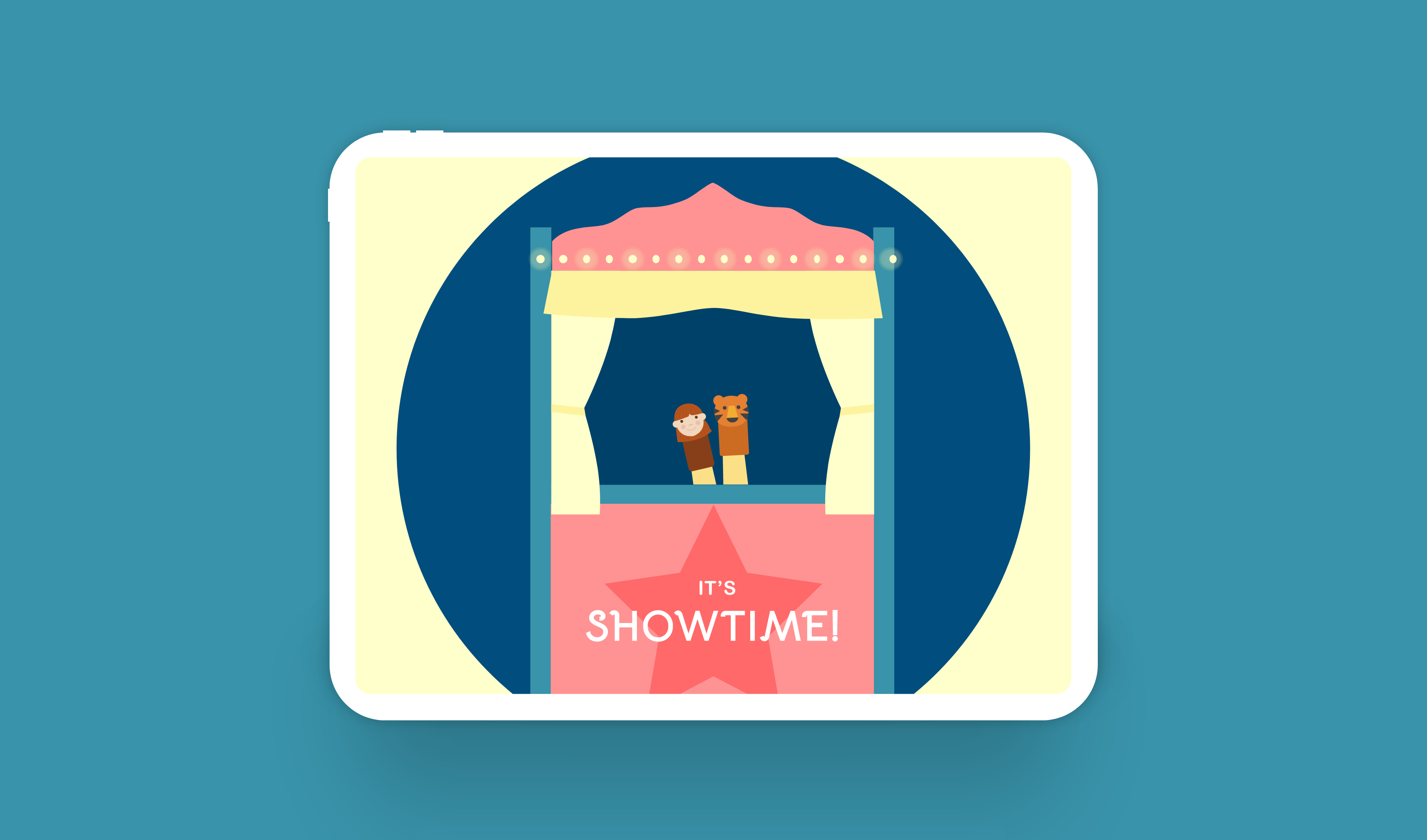
It's Showtime, a mobile puppet theatre, is a new and fun way for kids to explore storytelling. Kids can learn to animate, narrate and direct their own stories, digitally.
Role: Individual project
Duration: ~15 weeks
Project focus: Micro-interactions, Prototyping, UI/UX design (iPad), User testing
Tools: Adobe XD, Protopie
Advisor: Wenting Zhang, Sr. User Experience Designer 2, Adobe
*All icons and illustrations in this project have been sourced from flaticon.com and vectoreasy.com
kicking off with research
I began my design process with extensive desk research about storytelling and puppetry. I dove deeper into finger puppets to better understand its origin and its relevance to a more digital world.
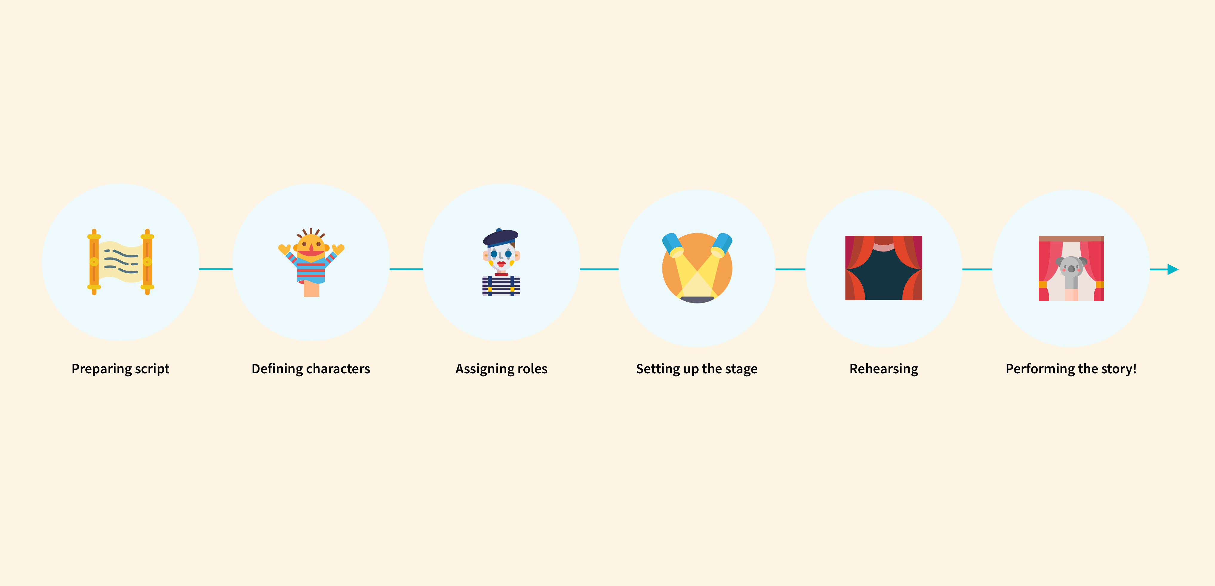
The journey of staging a show in puppetry
Based on my research, some key takeaways –
😍 What was great:
- It's a great way to learn storytelling!
- It is known to stimulate imagination and encourage collaboration.
- The technique uses physical gestures and sounds, encouraging natural human expression for growing kids.
😕 What wasn't:
- Staging a show requires a lot of planning, time & effort.
- Traditional finger puppetry in hard help and without collaboration.
- There's no ability to save a story, edit it, or share outside of a physical space.
- Staging a new story means changing and redoing everything - hard to create multiple stories in a short span of time.
Problem statement
Based on my research findings, I framed a problem statement –
How might we make finger puppet theatre easier and more suitable for a digital era?
Wireframes & flow
Next, I came up with wireframes and a basic flow for creating a story on the platform.
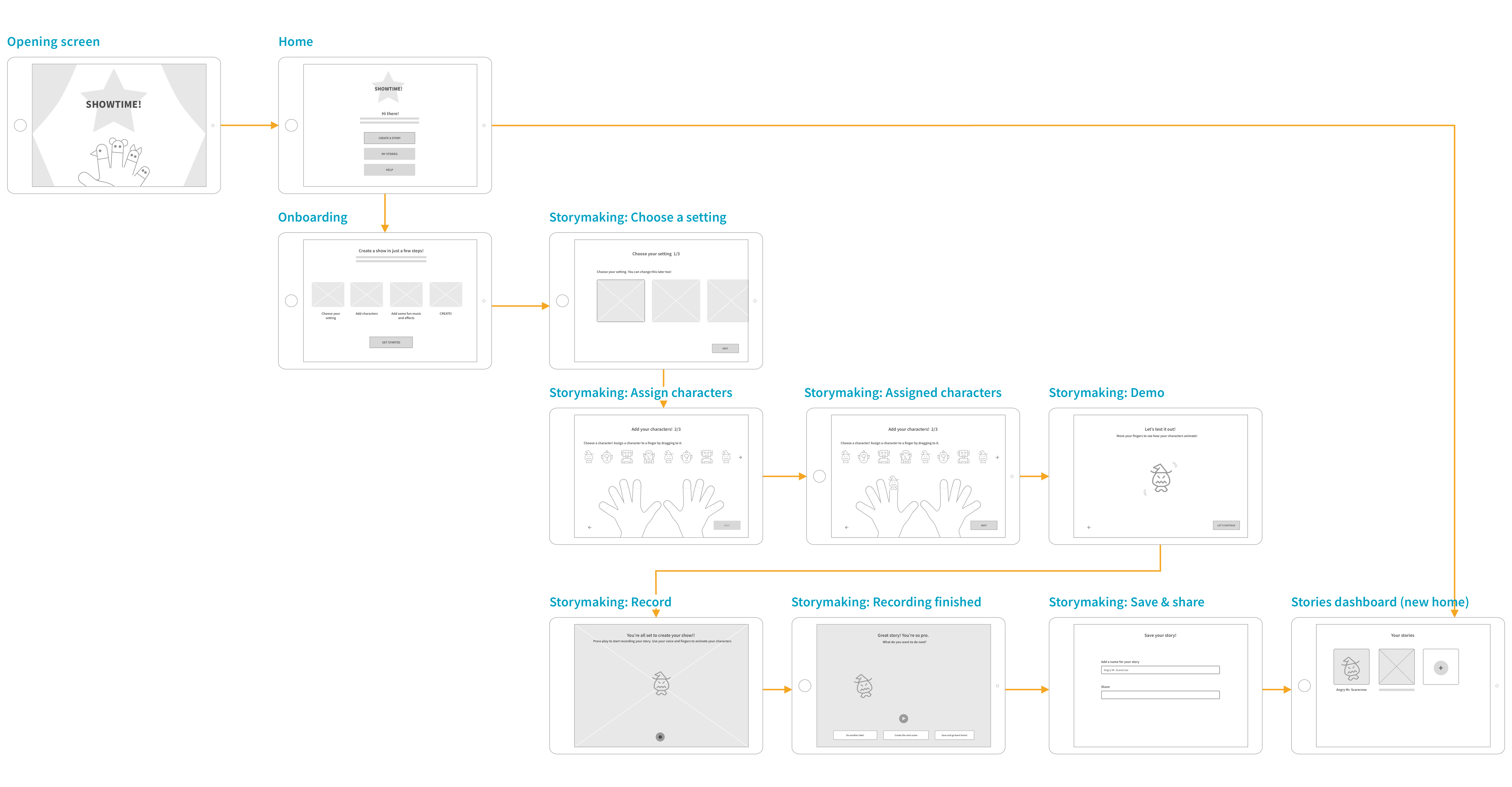
Flow: Creating a story
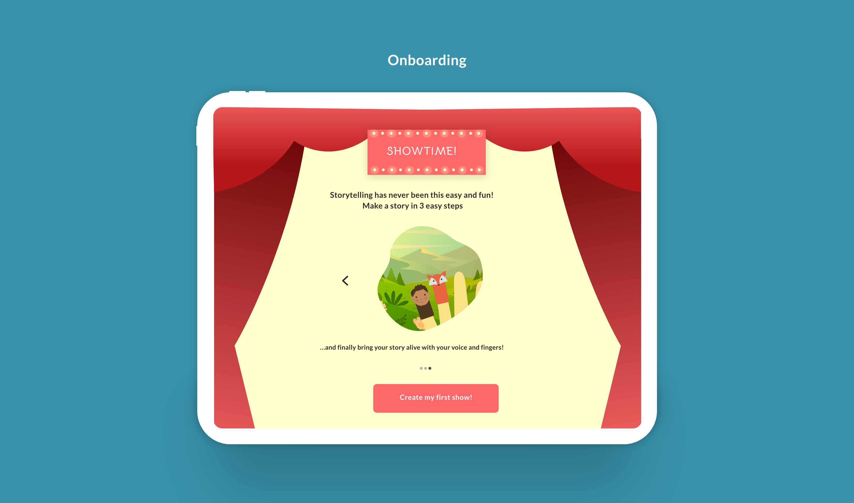
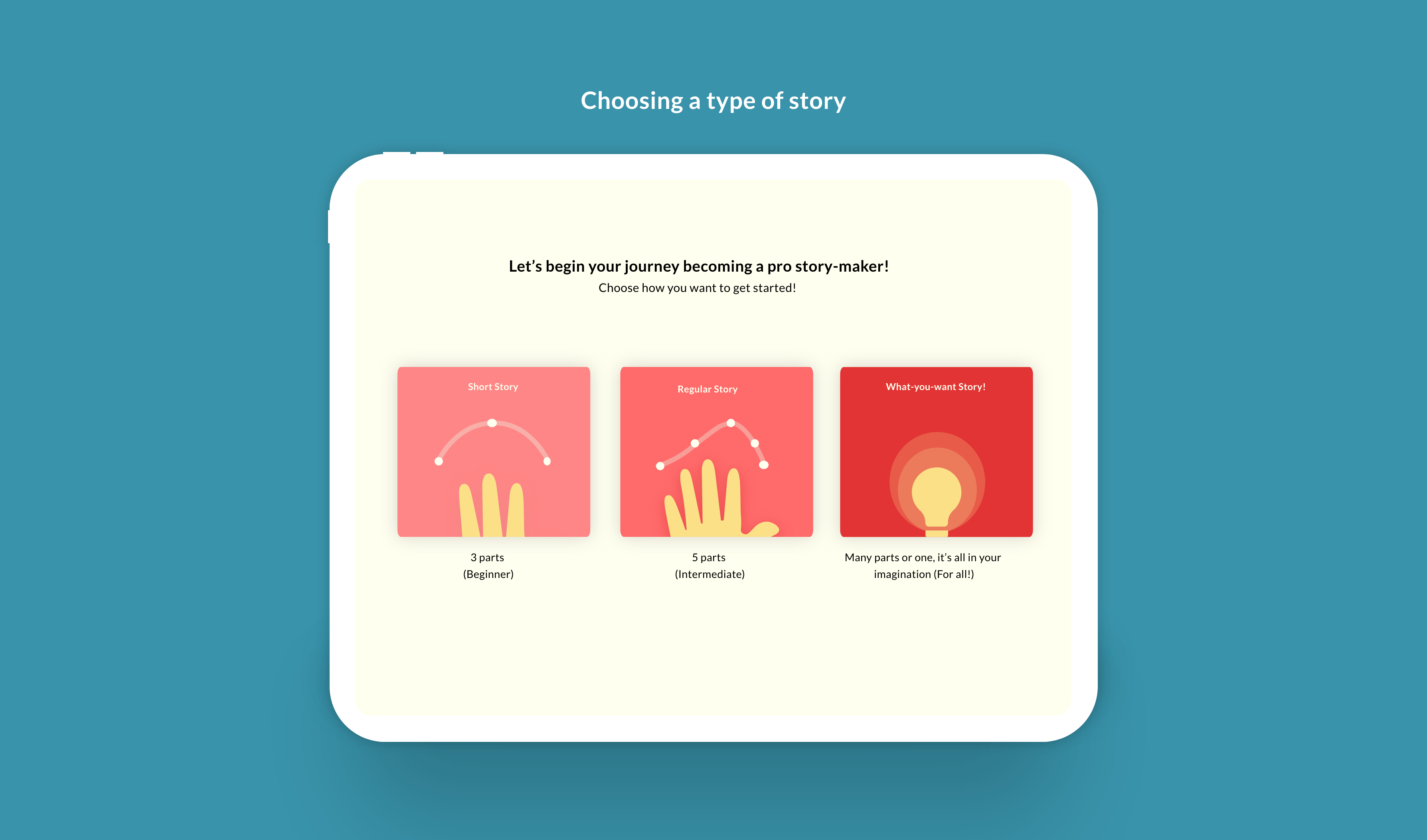
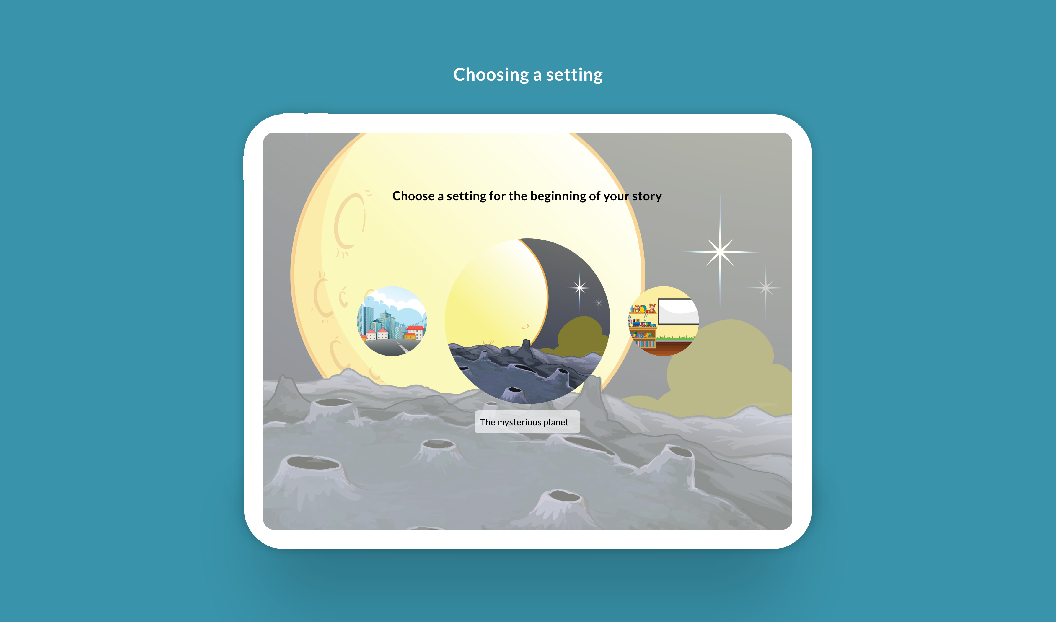
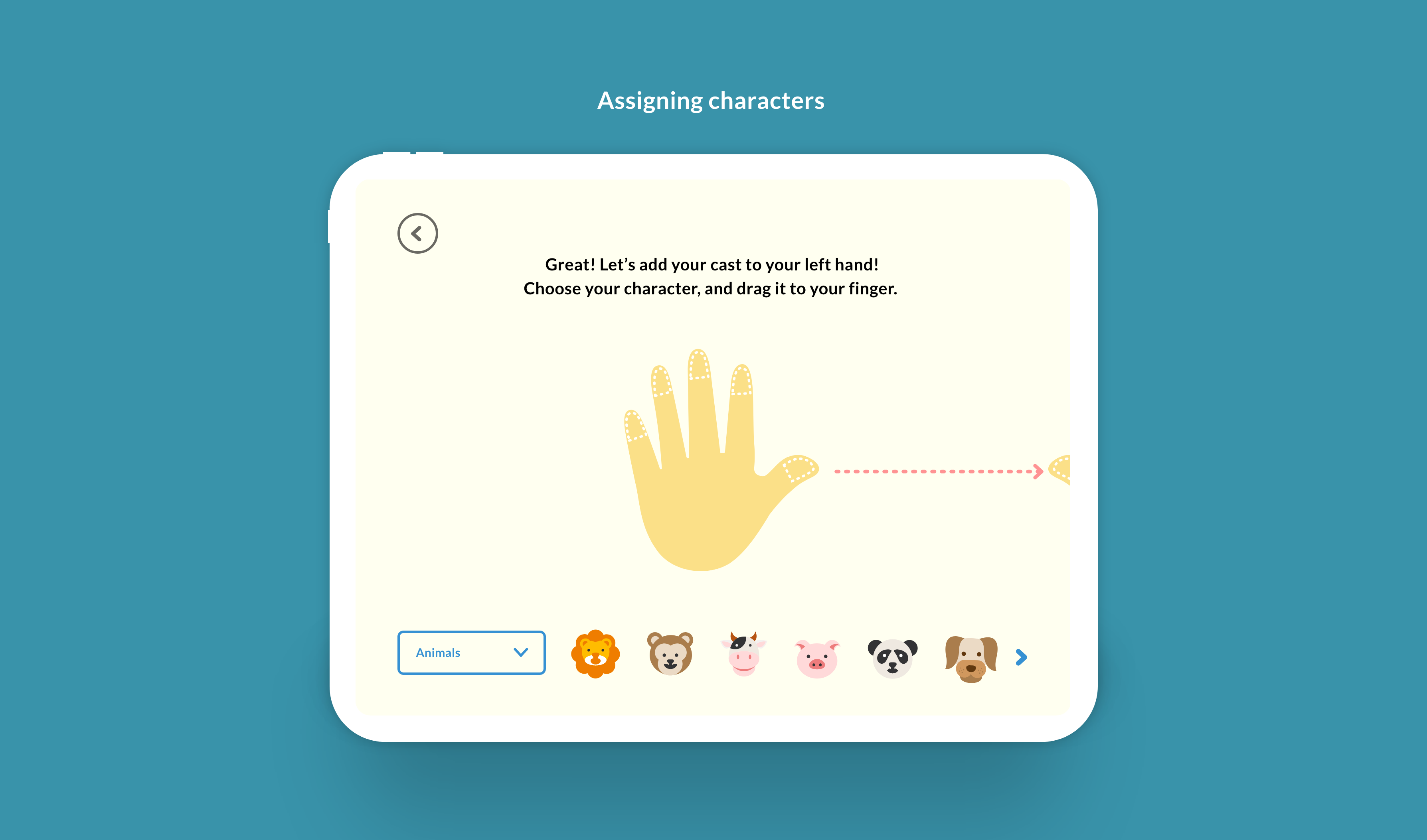
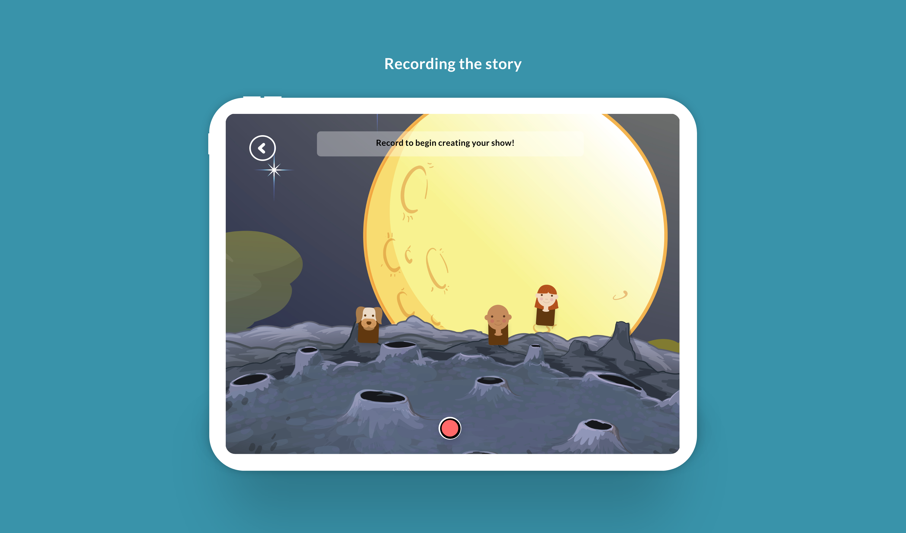
HI-fidelity designs: V.1
After getting an overall idea of the flow, I created hifi mock-ups based off of the wireframes. I planned the voice and design language to be centered around kids - bright colors , friendly fonts and a guiding and educational voice.
I did a round of feedback with my advisor, Wenting, for a few screens after which I came up with the first version of the designs.
user testing & findings
I did my first user-test with a classmate, Bowen, to test my flow. The session was helpful to get a sense of how unclear and confusing the concept could be for a person seeing the app for the first time.
Overall:
- The main concept wasn't not coming through, was confusing.
- The stages of storytelling from an educational stand point weren't clear.
- The last step of recording using one's hands wasn't being interpreted correctly.
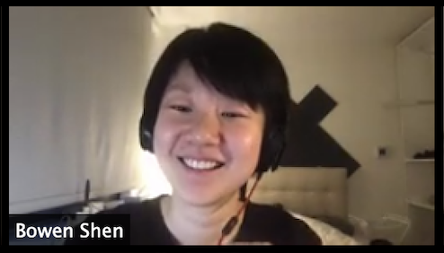
“The concept is fun, but the tutorial wasn't clear.”
– Bowen Shen
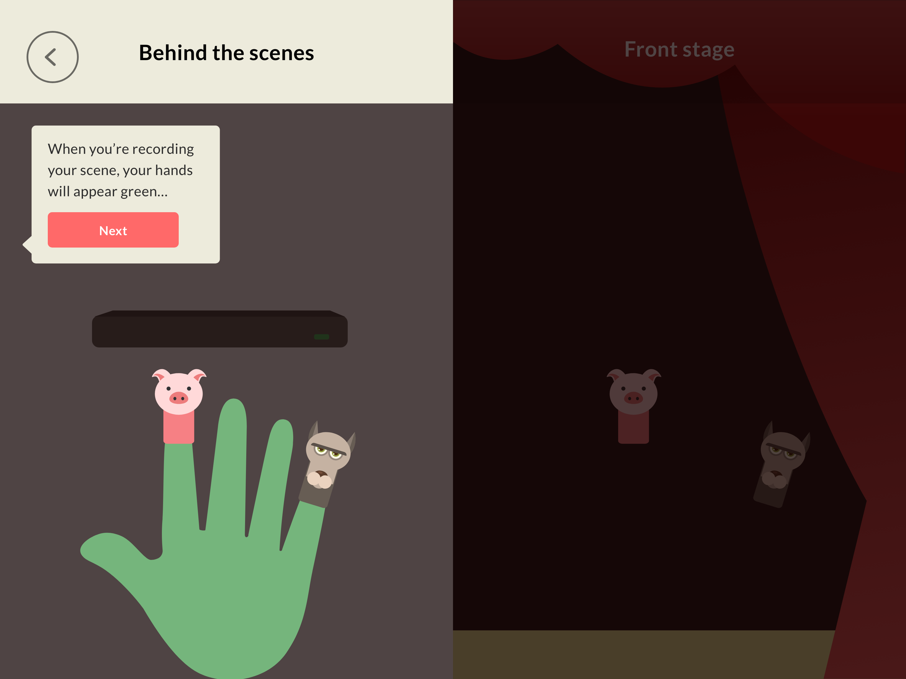
HIFI MOCKS: V2
Based on my user testing, I revised almost all the screens by adding more helper text and visual cues for each screen.
I also added short demo/tutorial before the user got to the final step (shown below). This really helped the user feel more prepared for the use of this new technology.
prototype
After a few rounds of feedback and iterations, I revised by screens and put together an interactive prototype to get a clear sense of the app as a whole and the flow.
Made another prototype just for the recording interaction on the app (last step) using Protopie which allowed for timed actions.
reflections
I learnt a lot about prototyping and all the different tools to prototype during the course of this project! And also about micro-interactions.
My concept for the project was a little harder to prototype considering the slightly steeper learning curve for a first time user. Repeated user testing really helped me understand and iterate on my screens and prototype to make the concept more comprehendible to a user.
Since I didn't get a chance to test with kids yet, not sure if they would be able to understand it, will need to test and validate through more user testing.
next steps
- Further iterate on tutorials to make them easier to understand, more visual and less text heavy.
- Potentially prototype along with a leap motion
- Test prototype with children!